
Meet Perry Shall, the Vintage T-Shirt Collector and Art School Dropout Who’s Nominated for a Grammy
The Philadelphia illustrator and art director for Easy Eye Sound is up for Best Recording Package, but he’s far from a newcomer.

I found out who Perry Shall was about six or seven years ago via a video posted onto Facebook by Super Deluxe. But it wasn’t a video about his artwork. No, it was focused on his extensive vintage T-shirt collection, and he was aptly titled the “T-Shirt King.” Shall showed off his seemingly endless walls of shelves packed to the brim with crisply folded, retro garb. “You can say anything with a T-shirt,” he said. And I believed him, so much that I felt inspired to start my own collection of vintage clothing. I was just a college freshman in search of something to fill the void between classes, and I found my niche in the form of scouring the World Wide Web for hours for the uniquest and most tattered tees I could find—and it’s all thanks to Shall.
And it was like the cosmos aligned right then and there. Soon after, I’d come across Shall’s work again via a tiny signature of his name on the back cover of Dan Auerbach’s solo album Waiting On a Song. I recognized it immediately, remembering Shall from that Super Deluxe video a few months earlier. A quick search on Instagram and I found Shall’s page, which was a treasure trove of vintage shirt designs, album cover artwork, a documented friendship with Gilbert Gottfried and collages of Columbo. The idea was clear: This guy is one of the coolest dudes we’ve got. But, that dude was just nominated for a Grammy Award and his vintage T-shirt collection is more than twice the size it was seven years ago. Shall is up for Best Recording Package for his work on The Arcs’ final album, Electrophonic Chronic, a much-deserved stamp of industry recognition after years and years of work designing covers for friends, heroes and strangers.
Shall doesn’t think of himself as a “designer,” though, preferring to label himself an “illustrator.” The boot fits. He didn’t take art classes in high school at all and, in middle school, he was only in the program because a friend of his (who was on the gifted track) vouched for him. Back then, the gifted kids at his school would take one semester or art and then one semester of environmental science. “My friend was like, ‘Hey you should be doing art outside of just drawing for yourself,’” Shall says. “I had no training, so she went to bat for me and told the teacher and then had me draw a bunch of random drawings, just to show her what I could do. I got accepted into this program just for art, so I’d take it all year instead of one semester like everybody else—and it was my comfort zone, because I didn’t have art classes regularly anymore.”
But in high school, Shall’s outlook switched to music. A friend’s mom encouraged him to go to band camp, because he played an instrument, and he became a self-proclaimed “music nerd” who took up marching band. Shall never quit doing art, though, keeping busy drawing band logos (his friends’ and his own) and nonsense caricatures of his peers. In community college, he became momentarily estranged from art and, eventually, dropped out. But, tasked with not wanting to disappoint his dad, Shall told him he was going to enroll in the Art Institute of Philadelphia. “I wanted to please my dad by not just saying, ‘I’m dropping out of college and working my construction job full-time—because I was doing heating and air conditioning,” he says. “I just made it up. ‘Oh, my friend, they go to the art institute and I was thinking maybe that would be cool.’ And, of course, my dad was thrilled. So, finally, I’m going to school for art. And I get there and it was a terrible experience.
In Shall’s own words, it was like “paying for a tech school and not an art school.” “Which is fine, if you want to go tech school,” he continues. “But they didn’t want you to have too much creativity, it felt like. I got sick of that pretty fast and I just went to work construction full-time.” The Art Institute, which closed its doors in 2018, didn’t have an illustration program. They had animation and graphic design and, because Shall had taught himself how to use Photoshop, he landed on graphic design.
But even then, he was miserable. He can pinpoint the exact moment when he realized that the Art Institute wasn’t giving him what his attention span and creativity required: A former student came by to speak with a class about what they had been up to post-graduation, and it was designing menus for restaurants. “I remember seeing this menu and being like, ‘I gotta leave this school. This is crazy. If this is what they’re trying to show off from their alumni…’ It was just so whack, I don’t know how else to say it,” Shall explains. “It was like, sure, that might work for somebody who just wants very basic graphic design, and it made me feel bad that I was going there. I never in my life feel like I’m better than anybody and, all of a sudden, I thought, ‘Am I better at art than these people? That can’t be possible, because I’m not that good at it.’”
After dropping out and cutting ties with academia altogether, Shall kept drawing and making art for his friends’ bands. Only this time, his friends had money and he was getting paid for his work. “It was mind-blowing, just that I could work a full-time job but also make money doing art,” he adds. “I do graphic design now and I do illustrations and collages. It really took me so long to realize my worth in any way. Because I just thought I was making goofy drawings, I just didn’t see my own value for a long time. I still have trouble with that, of course, as all artists do.” Shall stops himself. “The short answer is: I fell into it by accident and everybody kept thinking that’s what I wanted to do, and I was happy to do it.” Eventually, he had to stop working so many days a week at his construction job because he had too many art gigs to complete and not enough time.
When Shall first really started making headway with his art in the music industry, it was back when, as he puts it, “people were really connected to each other in a more personal way” on the internet. And what Shall means by that is bands would reach out to him for design commissions and it would be normal. “And, sometimes, those bands, they drew 30 friends—on a good night—to their shows,” he says. “But, if I had never heard of them before and looked them up and thought they were good, I was so stoked that some random person, who didn’t know me, wanted to hire me because they saw somebody else’s shirt that they liked and they wanted that person to make a shirt for them.”
In his 20s, Shall was a roadie for the New Jersey trio Screaming Females and, on a tour with JEFF the Brotherhood, he struck a friendship with the duo that turned into a fruitful, creative working partnership together. “If I was with my band or touring with another band as a roadie, I would just tell the band ‘Hey, if you ever need artwork, here’s my phone number,’” Shall explains. He toured with JEFF the Brotherhood and they liked what he was doing and, eventually, started having him design their shirts and album art. “I was with them all the time,” Shall continues. “I’d have a laptop and be ready, but I was worshipping that band before I was making art for them. They were my friends, but I idolized them as musicians.”
When 2012 came around, JEFF the Brotherhood teamed up with Auerbach for their 2012 album Hypnotic Nights and, initially, Shall passed on meeting Auerbach for the first time so he could finish some art for them before leaving for tour. “They were like, ‘Hey, we’re gonna go listen to the mixes of our new album at Dan’s studio. It’s really cool, do you want to come with us?’ And I was like, ‘No, I want to stay here and work on your album art,’” Shall notes. “And I think, honestly, it was because it was so satisfying to make art for them. I knew who Dan was but, to me, I felt like the Black Keys were still kind of an underground band. I didn’t realize that, besides having a song on Eastbound & Down and being like, ‘Wow that’s so cool that they got this,’ that they were such a big band.”
Indeed, the Black Keys were hitting an apex as a duo. A year prior, they won two Grammys for Brothers and, a year later, would win three more for El Camino—including Auerbach nabbing a Producer of the Year award. Needless to say, they were famous. JEFF the Brotherhood would return and let Shall know that they showed some of his art to Dan who, eventually, tasked him with drafting up the logo for the studio that would become Easy Eye Sound in Nashville. “I did it pretty quickly, and it was exactly what he wanted and I was like ‘Yeah, just PayPal me here’ and he paid me and I was like, ‘Wow, this is a great working relationship that makes my life easier,’” Shall continues. “We liked a lot of the same things. Dan’s references for stuff was similar to what I would have probably thought of. We talked a bunch and then went our separate ways.” A few months later, Auerbach hit Shall up again, this time to do the cover art for Bombino’s Nomad—a recent project he produced. Instantaneously, Auerbach and Shall were again on the same page and that’s when it set in: Art had finally become his job.
Shall has been able to focus on his art full-time for about 10 years now, and it helps that he’s the Art Director for Easy Eye Sound label since 2017—“the art director who directs himself,” specifically. But only more recently has he, admittedly, felt comfortable paying his bills. “For years, my whole thing was, at the end of the month, if I still have $100 in my bank account, then I’m like a god. I just was invincible. I paid my rent and I have money to eat, and that was so rewarding,” Shall says. At Easy Eye Sound, he does 99% of the album artwork, merchandise designs and band logos. The first record was Auerbach’s Waiting on a Song and, since then, he’s led art campaigns for label acts like Shannon and The Clams, Robert Finley, Yola, the Black Keys, Link Wray, the Velveteers, Marcus King and more. And beyond Easy Eye Sound, he’s worked with folks like Kurt Vile and Questlove.
If you take a quick look at the catalog of covers Shall has amassed over the last seven years, you’ll find an established and consistent look. It’s hard to describe the aesthetic of the covers, other than they are a living reference of what I want my life to look like. Each title boasts this perfect convergence of retro and modernity. The artwork feels connected to the music, which isn’t always the case at other labels. A couple dozen albums in and Shall is still finding new ways to incorporate elements and references that are fresh yet don’t clash with his and Auerbach’s tastes, style and musicality. “I’m not professionally trained, so there are things that I know need to be done for an album cover and, if I have enough faith that I can be the one to figure it out—whether it’s painting or something I haven’t done before—I try to challenge myself to do it,” Shall says.
“I don’t really think of my art as retro, because I’m not trying to make something new,” he continues. “I’m trying to continue a tradition of art that’s been going on with album covers since album covers had artwork. I still do a lot of the things that I do by hand. I scan in letters. I’ll buy a book at a thrift store just to use the letters and I’m scanning all these pages so I can get every character. And I don’t make a font. I do that so I can, individually, place every single letter—because that’s what they would have done when they made the artwork [in the ‘60s and ‘70s]—if they didn’t paint it by hand, all these letters were hand-placed. It feels more natural, you can’t make that with a font. You just can’t make something that organic. I mean, of course you can but, for me, I can’t. I need some kind of personal connection to it, so I might redraw the letters by hand. It might be a Helvetica font, but I will make it sexy. My goal is to make that look good and, if I think that Helvetica is the perfect fit, I’m going to do it the way I’ve seen it on a million albums anytime I go to a thrift store.”
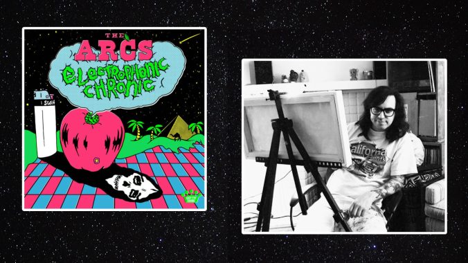
While Shall has made some of my favorite album covers of the last decade—especially the Tell Everybody! blues compilation from 2023 and Shannon Shaw’s Shannon in Nashville—his work on the Arcs’ Electrophonic Chronic has rightfully nabbed him his first Grammy nomination. Shall was tasked with turning the artwork of Omar “El Oms” Juarez into a bonafide, compact cover. El Oms had been the band’s longtime artist, ever since their 2014 debut Yours, Dreamily, and, because it was an Easy Eye Sound release, the design had to look like something that fits with the labels’ ongoing aesthetic canon while maintaining his flare—which was crucial to the Arcs altogether. “Dan sent me this drawing and it was just a black ink on white paper kind of drawing,” Shall says. “It was the apple from the cover with the Grim Reaper and a lighter. It was just black and white. That was it, that was the drawing I got. I was like, ‘Well, I’ve got to figure out what to do with this.’ When we were designing stuff, a go-to idea that we naturally had was ‘Should we try blacklight poster colors?’ It looks cool, it’s familiar, the colors are great and work well on a black background.”
The Electrophonic Chronic cover is unlike any from recent memory, largely because it’s flocked like an actual blacklight poster would have been 30, 40 years ago. But, Shall had no idea that there was any conscious attempt to make an over-the-top recording package. “At the time, I just wanted tto do what was appropriate for this release,” he adds. “It came so naturally, but I kept getting too deep into it—because I wanted it to feel authentic and I wanted it to be a proper tribute to Richard Swift. I wanted it to be authentic to the band’s already established look. It was a really great puzzle to solve.” While Shall didn’t go into this project with a goal of getting a Grammy nomination out of it, he’s glad it’s Electrophonic Chronic. He wasn’t thinking that, if he and Auerbach flock the cover, it’ll get more attention. It was a matter of paying respect to Swift and El Oms and the finale of the Arcs.
Shall is up against Caroline Rose (The Art of Forgetting), Hsing-Hu Cheng (Ensemble Cadenza 21’’s Cadenza 21’), iam8bit (Brad Breeck’s Gravity Falls OST), Yu Wei (Leaf Yeh’s Migration) and Luke Brooks, James Theseus Buck and Annie Collinge (Dry Cleaning’s Stumpwork), and there’s a distinct amount of separation between his cover and the rest of the field’s, stylistically. It’s obvious that the industry voters gravitated towards the familiarity in the blacklight design—and it’s great to see some of Shall’s design peers pay him his due. Pair that with a title as interesting as Electrophonic Chronic and the rising credibility of Easy Eye Sound, and it’s a very realistic possibility that Shall walks home with a Grammy next month. But he’s not really thinking about whether or not he will win. “It sounds cliché, but I feel like I already won, because it’s such a crazy thing to tell your family that you were nominated for a Grammy,” Shall explains. “I think the art does what an album cover needs to do. It grabs your attention, it’s hard to ignore. I’m glad anybody would see anything in it.”
What makes this nomination so important not just for Shall, but for all of the old-soul artists out there, is that it’s the epitome of a design that resonates with people. You can say that about all of the work that he does, in that it evokes a warmth from everyone who spends time with it. “Some of the album covers that I worship are the records designed by people I wouldn’t have even known by name if I didn’t find it at a thrift store, or something,” Shall concludes. “To me, I want somebody to be in a record store and flip through records and have no idea what [Electrophonic Chronic] is. I want them to say ‘What year did this even come out?’ Not because I want them to think it’s old, but because I want it to always work. I want it to be timeless. And that’s really what I want to do with everything I make. And this record, I really wanted [to make something] that my dad would think is cool. But, I also want a 16-year-old kid to think they want to check out this record, too.”
Matt Mitchell reports as Paste‘s music editor from their home in Columbus, Ohio.