
The 2016 Nexus Phones May Debut a New Google Launcher
Gifs via Android Police
Yesterday, king of Nexus rumors Android Police reported that a new launcher could be in the works for the 2016 Nexus devices, previously reported to be manufactured by HTC with the codenames Marlin and Sailfish.
The new launcher would bring substantial visual changes to the current Google Now Launcher, but the core user experience would remain largely the same. As AP’s David Ruddock notes, the first big change is the removal of the app drawer icon.
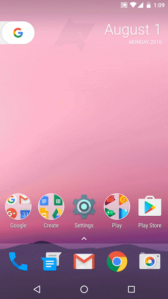 To be clear, the app drawer itself is still there, just the icon has been removed. Early reports around Android Nougat stated that Google was looking to remove the app drawer from Android in a future version, a possibility I vehemently protested, and the removal of the icon could be a compromise from the Mountain View team. Perhaps Google just wanted a way to fit more icons into the dock, meaning the app drawer and its icon had to go. More likely, though, is that Google may be warming its core users up to a future life without the app drawer by making its existence less immediately apparent.
For now, though, the drawer lives on and is accessible by swiping up from the new “frosted” section of the screen that houses your dock apps. There is also a small arrow in the frosted section that you can tap to immediately open the drawer. Once opened, the app drawer is nearly identical to the current Now launcher version, save for a redesigned search bar. To close it, simply swipe down from anywhere that isn’t the notification or nav bar, or hit the back button.
I don’t love the idea of a “frosted” section, but I understand the need for a visual indication that one area behaves differently than another. It does ruin the simple elegance stock Android has had since it made the notification bar and dock wholly translucent, though, which is a minor step backward. All together, the launcher retains Google’s good design sense, and is in general a sleek and modern interface, so there is not much to complain about in actuality. There is also the fact that I have not seen it with my own eyes, and it may look very different once, if ever, it hits Nexus phones, so nitpicks are essentially barbarous.
The other big change, and infinitely more noticeable upon a glance, is the removal of the signature Google Search widget. It’s been replaced by a calendar widget (which, while handsome, is not removable and thus tragic) and a “G” button/pull-tab. Tapping the G opens search, but nothing happens if you pull it. One could safely assume that will change in the final release given the orientation of the button screams for it to be pulled.
 Google is notorious for cutting new software designs at the last minute, so it’s possible none of this will actually see the light of day. But the evidence is quite strong, especially when you consider the company’s push into AI with the Google Assistant, and the likelihood that the new service will play a large role in the 2016 Nexus phones. Removing the search bar may be a visual push to users to utilize the new assistant functionality.
Of course, we won’t absolutely know for certain until Google unveils Sailfish and Marlin sometime later this year. Usually it’s in the October-November range, but with reports that Android Nougat could be released as early as this week, we may not have to wait that long this time around.