
Doomsday Clock’s Gary Frank on Channeling the Gritty ‘80s Dystopia of Watchmen

British-born comic illustrator Gary Frank has spent a career modernizing the dream of the superhero. His 2003 run on Supreme Power with writer Michael. J. Straczynski, and the 2006 follow-up, Squadron Supreme, unspooled thinly veiled versions of DC Comics figureheads in a Realpolitik miasma, merging the fantastic with the depressingly pragmatic. Frank later crossed the bridge from analogue to source material with copious runs featuring Superman, the majority alongside DC Chief Creative Officer Geoff Johns. His take on Kal-El injected the soul of actor Christopher Reeves into pop culture’s most optimistic icon, creating visuals at once heart-breakingly nostalgic and irrevocably timeless. Of note, Frank layered reams of emotion within his characters’ eyes, ranging from the alienated melancholy of a Kansas farmboy to the unhinged sadism of the Joker.
Frank and Johns have reunited for Doomsday Clock, a direct sequel to what many laud as the greatest superhero comic in the medium. Clock shows the direct fallout of Alan Moore and Dave Gibbons’ Watchmen, the 1986 graphic novel gamechanger that framed the era’s turbulence in a story about ex-heroes coming to terms with their value in a world teetering on implosion. 2017 has, in many ways, felt like a sequel to the callous policies of the Reagan administration: proposed tax bills unapologetically promise to widen the wealth divide and nuke-welding leaders trade insults in public. Frank reintroduces seminal figures like Rorschach—a nihilistic vigilante with a mask of ink floating in a liquid matrix—and Ozymandias, a genius whose ploy to unite the world with a faux alien attack left millions dead. Like Supreme Power and Squadron Supreme, these characters are analogues of another set of classic superheroes—characters from Charlton Comics, which dissolved in 1986, though many were acquired by DC in 1983.
But Doomsday Clock also promises another bridge between its foundation and the marquee capes of DC Comics; Batman, Superman and Lex Luthor will cross paths with an ensemble that was created to analyze their literary existence. It’s a heady, controversial project, but as readers saw in last Wednesday’s first issue, its questions and tone are captivating. Frank and Johns also revealed two new characters—freed villains The Mime and The Marionette, who bear a passing resemblance to the sociopathic union of Harley Quinn and Joker (and Charlton refugees Punch and Jewelee) with intriguing mysteries all their own.
Paste exchanged emails with Frank to dive deeper into this seminal project and the balancing act of respecting and innovating on top of a comics benchmark. ![]()
Paste: What was your experience with Watchmen? Were there any characters you were particularly excited to address?
Gary Frank: I think I was, like a lot of people, drawn to Rorschach when I first read the book. Clearly, he’s a horrifying person, but there’s a sincerity to him. I like Doctor Manhattan, though. He’s so epically tragic. In the end, Rorschach only loses his life but the person he is—as well as what he is obsessively trying to achieve—are intact. Manhattan is lost, though. The power that he has, what it means and what it costs, these are fascinating things.
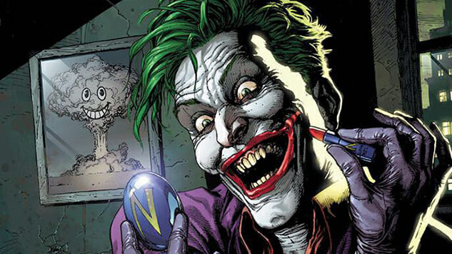
Doomsday Clock Cover Process Art by Gary Frank
Paste: Was there an attempt to create visual continuity between your approach and Dave Gibbons’ aesthetic? For example, I notice some more hatching here if I’m not mistaken.
Frank: Well we started out with the layout, the storytelling style. I was very immersed in that and I think it’s inevitable that a certain amount of Dave’s style seeps in. Working on these pages feels very different to previous works. When you are trying to evoke that environment, that atmosphere, you can’t help but kind of fall into step with the thing that you are following.
Paste: What was the most difficult hurdle bridging your styles?
Frank: I think the abandoning of certain tools took a bit of getting used to. We aren’t using sound effects, for example. The splash panels, insets, overspills etc. All the tricks and techniques that help with emphasis… they’re all gone. The panels don’t really vary. There’s a rhythm to it, though. You lose some bombast, but you gain clarity and you get to drop back out of the limelight and let the story become the whole thing. It’s like going back to how comics were before that period when everyone started thinking that the art wasn’t just there to serve the story. And then going back a bit further.
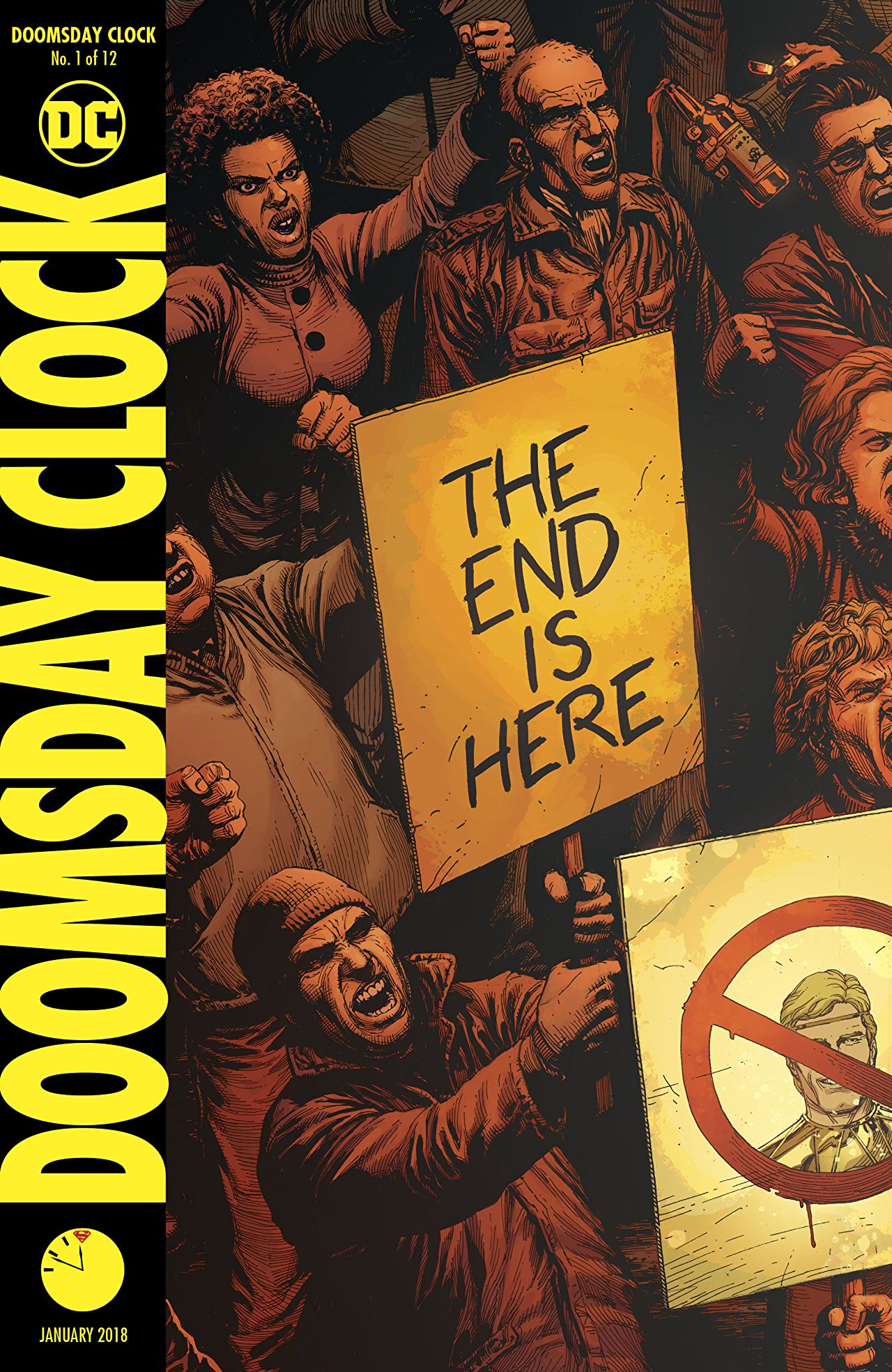
Doomsday Clock Variant Cover Art by Gary Frank and Brad Anderson
Paste: Do you use a different approach when illustrating the DC characters to emphasize their relative moral purity?
Frank: So far the DC character that I’ve drawn the most in this book is Batman and he’d frankly fit into the Watchmen Universe beautifully. No, the dominant influence is Watchmen. There will be subtle changes between worlds—colors, for example—but not so that it becomes intrusive. It’s not going to be Bedknobs and Broomsticks.
Paste: Watchmen confirmed the nine-panel grid as the de facto format for serious, scholarly comics, only breaking form once. Most of the pages follow that same schema, with various breaks into 7- and 8-panel pages. What dictates breaking type? Is there an underlying rhythm at play?
Frank: Yes. Virtually everything you do with the size and shape of a panel has a subtle effect on how the contents are perceived. There are instances in Watchmen where there are four panels on a line, for instance. When you are reading a three-panel line, three-panel line, three-panel line etc, then there’s a switch to four, the reader may not notice it consciously, but there is a shift in rhythm. You can use smaller, choppier panels to increase pace, or maybe give the feeling of quiet or secretive actions. Alternatively, you can use it to shift between environments for a flashback or a dream sequence (as in Watchmen). The restriction imposed by the nine-panel grid has the unexpected effect of making even small changes to the rhythm more effective.
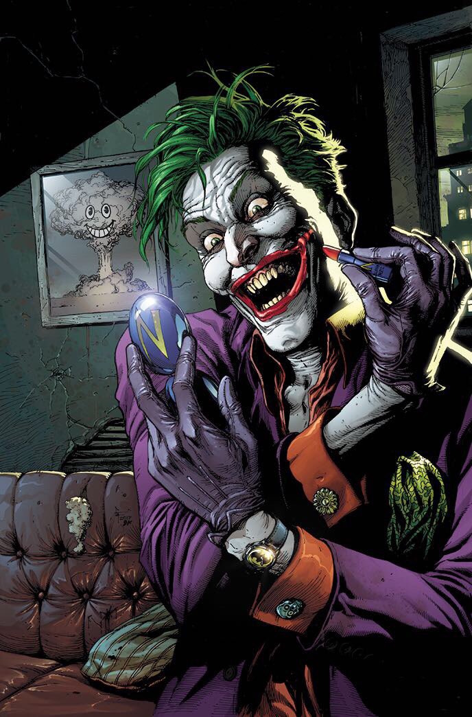
Doomsday Clock Interior Art by Gary Frank and Brad Anderson
Paste: In the opening panels, you nicely preserve a sense of place that corresponds with a ravaged ‘80s NYC. The double-breasted jackets, analogue media, concrete jungle, etc., but then you slowly reveal the ergonomic cars. How would you describe the architecture and environment of Watchmen? What’s changed?
Frank: Well, some of those things came about in Watchmen. The electric cars, for example. There’s pre-Doctor Manhattan Watchmen U and post-Doctor Manhattan Watchmen U. We obviously pick up in the latter so there’s this weird juxtaposition of a DCU, which is effectively 30 years in the future, and a 1980’s Earth that has been changed completely by Doctor Manhattan’s presence into a kind of pseudo-futuristic version.
Paste: On the latter note, you also had to design new characters—The Mime and The Marionette. Aside from the source material, where did you seek inspiration? Did you return to the old Charlton characters at all?
Frank: No, the Charlton characters were the jumping-off point, but from there we wanted something new. Geoff already knew the role that they needed to fill so we started to build something tailor-made for the story.

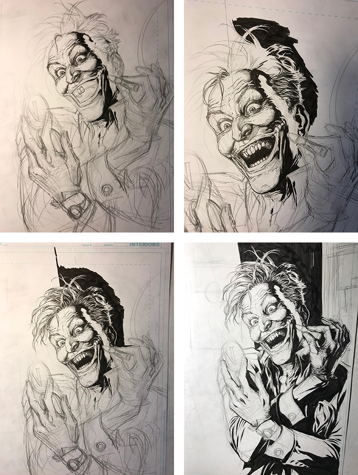
Doomsday Clock In-Process Cover Art by Gary Frank
Paste: The original Watchmen scripts were phone-book thick and dense with material. You and Geoff Johns have an extensive history, but did your creative process shift at all to tackle Doomsday Clock?
Frank: Totally. The scripts are a little tighter than usual, but the planning and framework are much more complex and time consuming. The Watchmen scripts seemed to define every detail in every panel, whereas Geoff leaves a little more flexibility. Much of what you’ll see comes as a result of conversation rather than because it was there in the first run at the script. Geoff is tweaking and molding the story all the time, guiding it as it grows organically.