
Comics Lettering 101: Clayton Cowles on How Fonts Channel the Drama of Mister Miracle

Comics conjecture tends to revolve around story and illustration, with journalists and fans giving borderline-exclusive attention to those two trades while neglecting the more subtle elements of the medium. But the importance of lettering can’t be underestimated; the layman may not be able to articulate its nuances, but good letterers give dialogue and sound effects heightened agency, while subpar executions can leave the storytelling flat and, worse, hard to comprehend. These craftsfolk utilize a host of technical applications, manipulating fonts, kerning, tracking, leading and strokes to ensure a smooth, stylized interpretation. Letterer Todd Klein has received 15 Eisners for channeling a litany of aesthetics and eras on titles including The Sandman and The Invisibles, while John Workman helped convey the epic, space theatrics of the ‘70s and ‘80s through letters.
Letterer Clayton Cowles has taken a versatile approach to a slate of diverse comics, each demanding its own fine-tuned take to the craft. His resume includes Star Wars, Batman, The Wicked + The Divine, Bitch Planet and Daredevil to name a few. But his latest project, Mister Miracle, requires a unique approach. Written by Tom King and illustrated by Mitch Gerads, the comic uses a quirky messianic escape artist created by icon Jack Kirby to address the corrosive anxiety of 2017.
Cowles’ lettering contrasts traditional, gleaming superhero optimism with a reality that refuses to stop falling apart, and he does so beautifully, using slick, elongated fonts against muddy and cracked letters. To take a deeper look at how lettering is essential to storytelling, Cowles walked Paste through his creative approach to lettering Mister Miracle #2, which you should absolutely read before jumping into the third issue, out this week. We’ve also included links to the fonts for anyone looking to dive deeper into the world of serifs and strokes. ![]()
Font: Evil Schemes
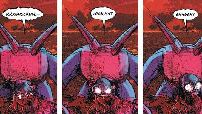
This font is called Evil Schemes, and it’s made by Comicraft, as are most of the fonts in Mister Miracle. It’s a distress font that’s made to look staggery and inconsistent with all the letter forms. I’m trying to go a little bit loose with Mister Miracle, because I know Tom [King] encourages experimentation. Whenever I see a chance to give a custom voice to a character, which I often avoid, but here it calls for it, I’ll go for it. Since the Parademons are often non-characters, it seems like a chance to cut loose. I figured there probably won’t be too many of them throughout the book because it’s mostly about Scott and his journey through his own anxiety. So I gave it this wacky font and I applied a roughened filter to its balloons—trying to make it look the way I think it would sound. This thing is scary, but I have to imply the scariness. It’s a fairly mundane scene in the life of a Parademon, so this is just how it operates. The lettering isn’t too loud—it’s just how it sounds.
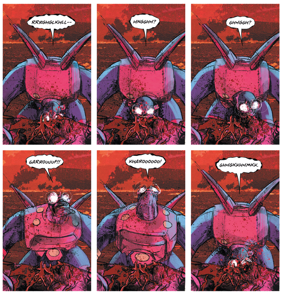
The stroke around the word balloon is an Adobe Illustrator filter. In the way I letter, and the way most letterers work, there are actually two balloons where you only see one. The stroke is its own shape that’s placed in the file behind the tail. Traditionally, that white balloon that you see right there is on top of the tail. I use the same filter over both balloons, but I didn’t base the filter around the same shape. So each of those balloons have the same effect applied to them.![]()
Font: Sunbeat
I was specifically asked by Tom to use kitschy fonts any time you see the word “Mister Miracle” or the credits, I should use a font that would be used by Jack Kirby back in the day. What I’m going for at least is to juxtapose how this character is seen and how he sees himself against what’s going on around him. Which is also why the main dialogue font isn’t as gritty or anxious as the rest of the book would be. It was chosen, just not because it looks good with Mitch’s art, but I think it works, ultimately, because it adds that juxtaposition. I think this font was designed specifically to emulate old jazz records from the ‘40s and ‘50s. I got it off MyFonts when I was going on a mad tear, stocking up on credits to use on Mister Miracle. I’m trying to use a different font for every issue for the titles and credits, and just to amuse myself. It’s fun. ![]()
Font: A Likely Story
I think this font is highly legible. It’s the most legible font of all the ones I tried out. We tried out four or five fonts against a page when we were first trying to get the look down, and this is the one everyone liked the most. It works for that reason; it harkens back to the original Mister Miracle comics, but also works against the generally anxious tone of the book. ![]()
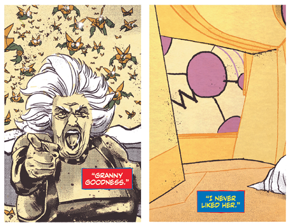
Character Caption Colors: Blue Stroke, Red Fill (Orion), Red Stroke, Blue Fill (Barda)
DC has line-wide rules for how their captions should look for respective characters. In the mainstream DC titles, Batman captions will always have the same color schemes because they want them to look consistent. Yes, Mister Miracle is officially part of the DC Rebirth Universe, but it is somewhat set apart, and these are characters who aren’t used that commonly. I used colors that I thought would best fit each character’s costume, to indicate to the reader who’s speaking. The “Granny Goodness” quote is from an Orion caption.
The challenge with this is that so many characters have costumes with primary colors: yellow, blue and red. Figuring out how to arrange the captions so they stay distinct has been a challenge. It would have been very easy to make Barda and Orion have completely identical captions. I also don’t want to end up making a caption that’s going to make somebody’s eyes bleed—especially with the color red. It’s easy to make it too harsh. Red used to be a color that printed odd in so many books. I kind of try to avoid it, but at the same time, here it was absolutely necessary because red is such a common element in so many costumes and throughout the book. ![]()
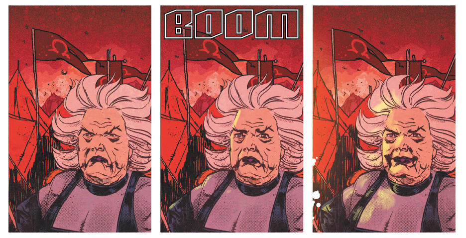
Font: Deadline
There are a few fonts floating around that look like that one. They’re based on the sound effects lettering of John Workman, particularly from his letters in the 1980s. And they’re often used for really big, epic sound effects. They don’t necessarily look the way they would sound, but they absolutely get the atmosphere across. It seems like a good font that would fit well in the nine-panel grid that’s used completely throughout the series. It’s kind of square, and it will be easy to make it look the same each and every time because it’s so uniform. And I could give it a cool outline shape and have it still be legible, where it could synch up to the visual cue of the boom tube. It has all those hollow rings emanating out of it. I gave it a transparent fill to match it up to the visual of the boom tube, but not obscure too much of the art work. ![]()
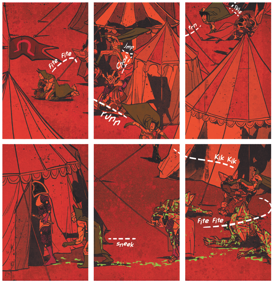
Font: Blambot FXPro Light
There’s a story behind those sound effects. When I first got the page, it had fewer sound effects on it—those two “sneeks” on panels two and eight were on it, and I think the chalk on panel five was there. But I had done the chalk like any traditional sound effect. But Tom saw the “sneeks” and liked them so much that I had to give each dotted line its own sound effect, and he requested that all those sound effects be done with that font. This was part of the Tom King genius here. Credit goes to him. I use Blambot FXPro Light and FXPro Heavy on this book. They’re very dependable fonts that I’ve stuck to throughout the years.![]()
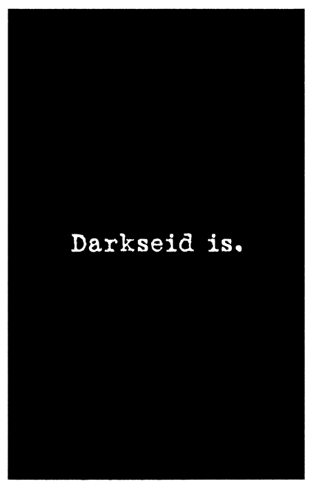
Font: Love Letter Typewriter
I had used a different font that looked somewhat similar to this, but it was more distressed and didn’t have serifs on it. Mitch said to use this font. That’s the creative process behind “Darkseid is.” They had used the same font in The Sheriff of Babylon for similar effects, and they wanted to keep that going here. ![]()
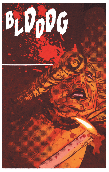
Font: Rumble
Stuff’s getting broken, and stuff breaks into different-sized pieces. The font’s name is Rumble, and that makes sense, because that’s what it looks like. [When deciding where to put the lettering on the panel], I just see it. One of the big things we were taught in school was how to spot positive and negative space. I usually just try to fill negative space with sound effects. With the way I placed it here, I tried to still convey the space of the sound effect, but put it in a place where it wouldn’t get in the way of the action, and still balance out the rest of the panel. Here, it doesn’t cover too much of the blood splatter, but if I put it anywhere else it would cover Granny’s hair, or the candle being dropped. It also would have tilted the panel off balance, because so much of the panel would have been on the right side. This way, having it on the left keeps things balanced. 