

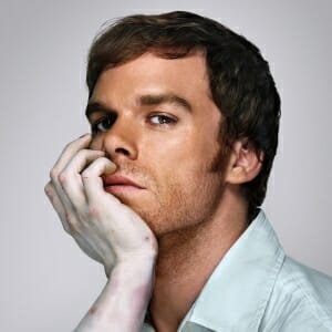
It’s hard to imagine an opening title sequence that would be too disturbing for a program that revolves around “America’s favorite serial killer,” but such was the case when the first draft of Dexter’s opening title sequence was nixed.
The most obvious distinction is this version’s heavier, more ominous theme that’s wonderfully chilling. Other than that, the first cut sticks to the same premise—following Dexter Morgan through his morning routine—but it’s certainly darker. The editing of the scenes is also different, using some of the same images as the existing sequence, but sliced and chopped in a way that mimics the frantic chaos of a feeding frenzy.
Eric Anderson, the creative designer behind the title sequence, explained the process: ”[The show’s creators] kept using the word “mundane” over and over. They liked Six Feet Under and Nip/Tuck for how mundanely both titles dealt with what could have been a visually hyperbolized depiction of each show’s subject matter.
“We then started examining normal everyday things that could be seen as horrific…. I believe the original idea was to have him do these normal things violently, but that soon became the idea of recontextualizing normal everyday things in a sinister way, kind of how crime scene photography does as I described earlier.”
While the existing sequence struck a balance to please Showtime, this opener would have undoubtedly made a killer (no pun intended) first impression. However, had this form been used, audiences would probably have a completely different idea of the Miami forensics expert-turned-killer.
You can read more about the construction of the title sequence here, and make sure to watch the “too dark” draft below.